FARMOLOGIE
Making sensitive sexy - through creative branding.
BACKGROUND
The Child's Farm toiletries brand initially created Farmologie as a go-to product for mothers who had experienced the benefits of Child’s Farm sensitive skin products on their children and wanted some for themselves! Child's Farm soon realised there was a wider, younger audience that wanted the same quality products for their sensitive skin.
BRIEF
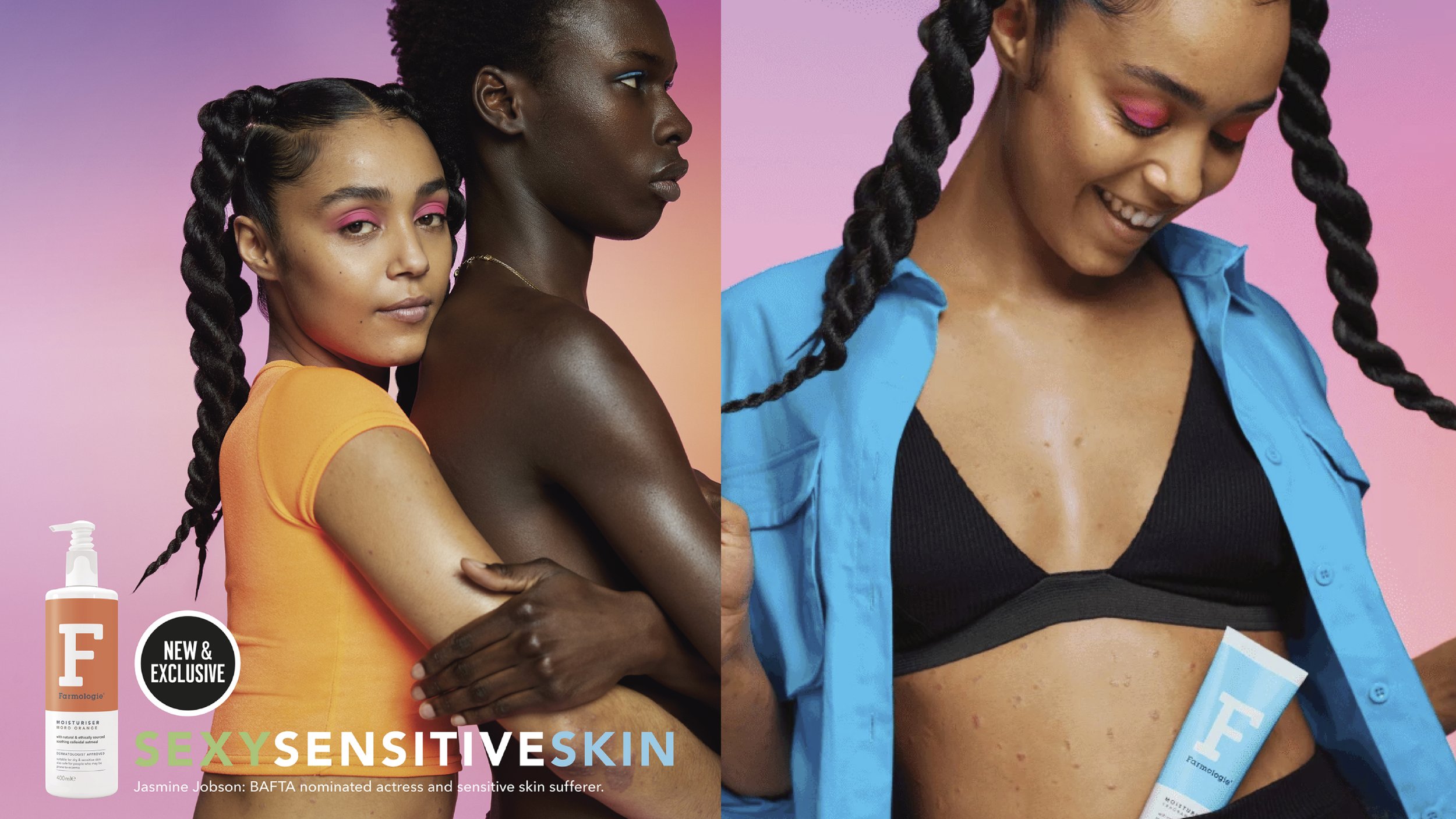
Re-create the Farmologie brand so that it speaks to the Gen Z crowd.
CREATIVE SOLUTION
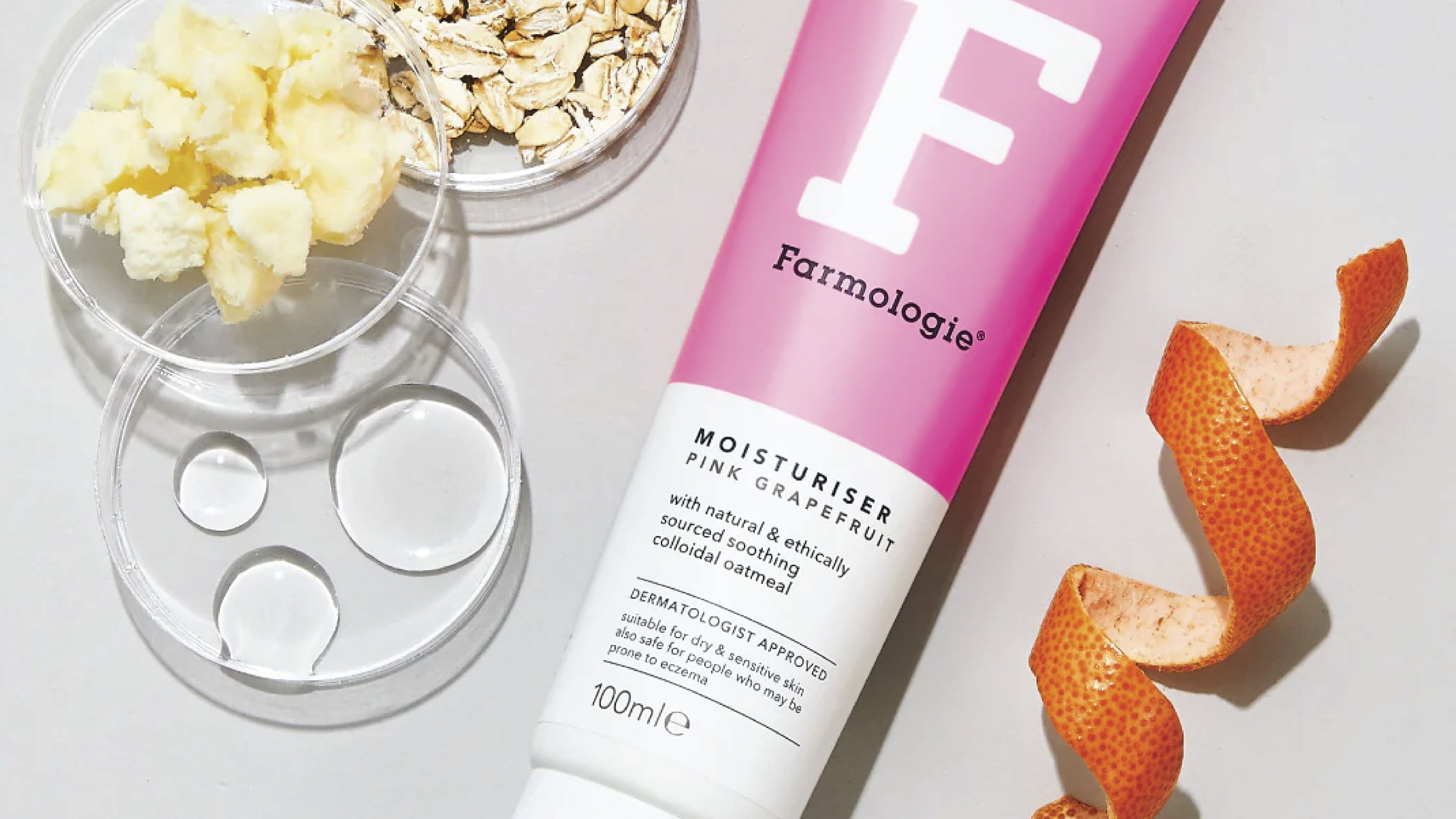
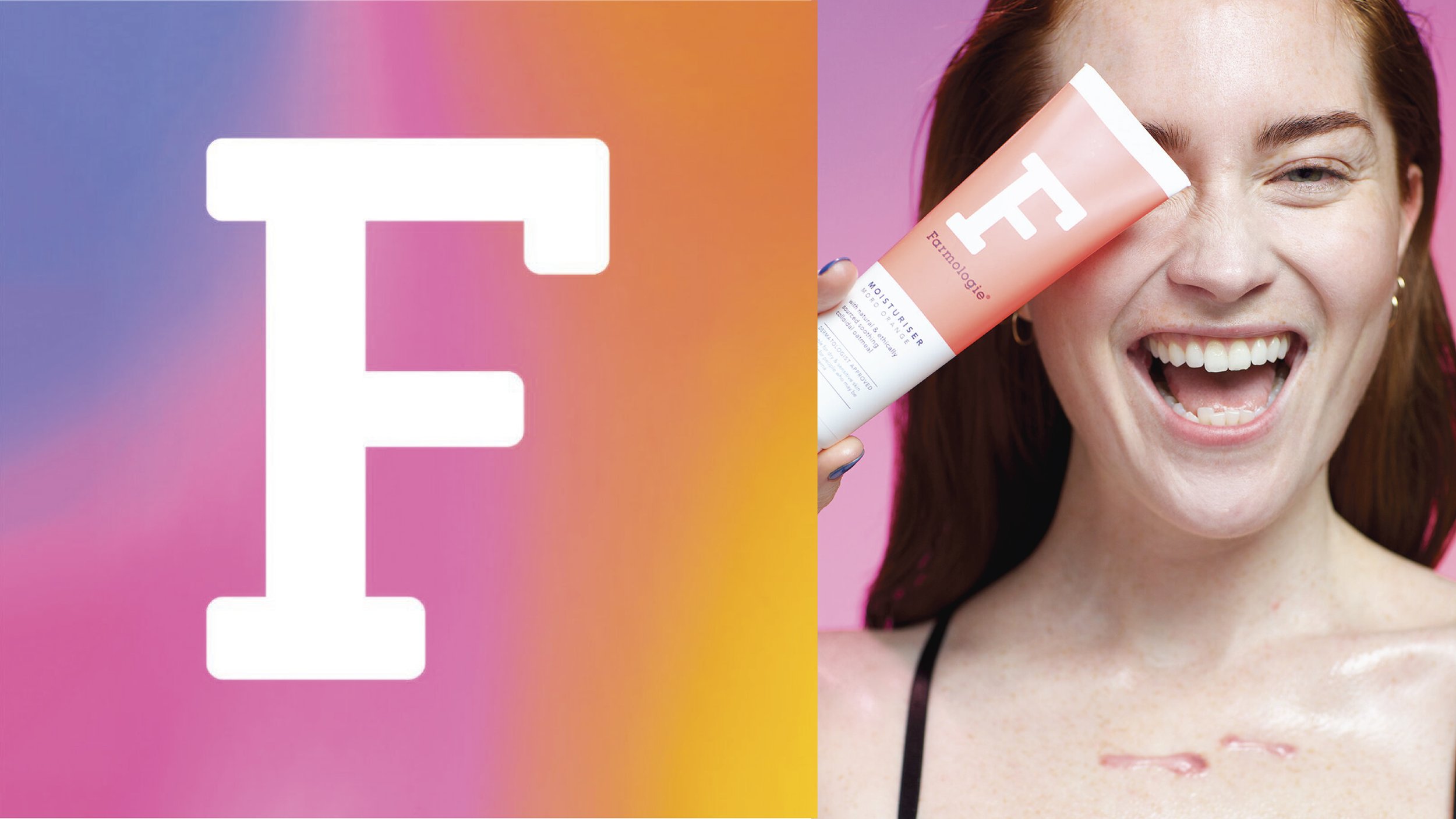
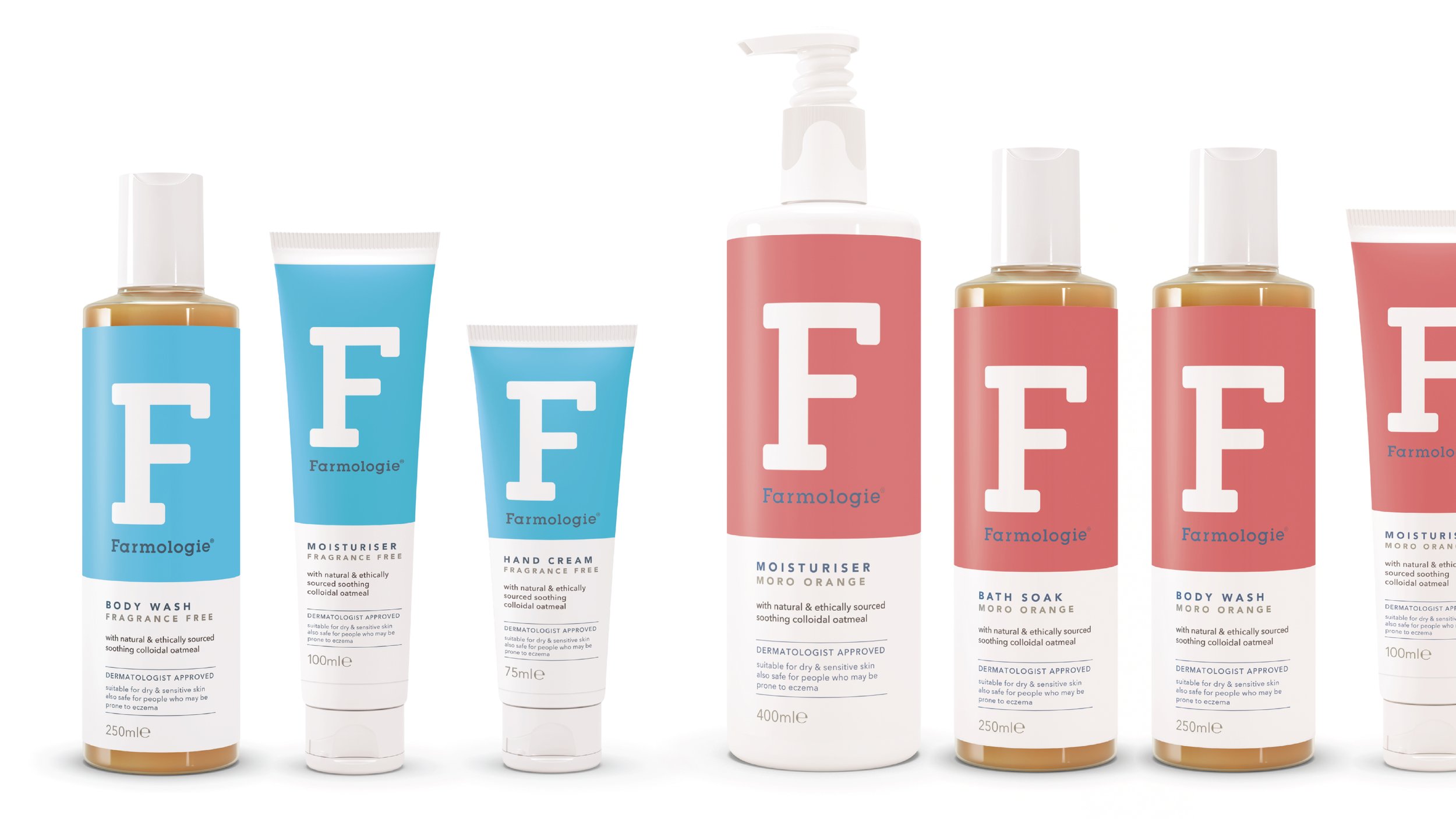
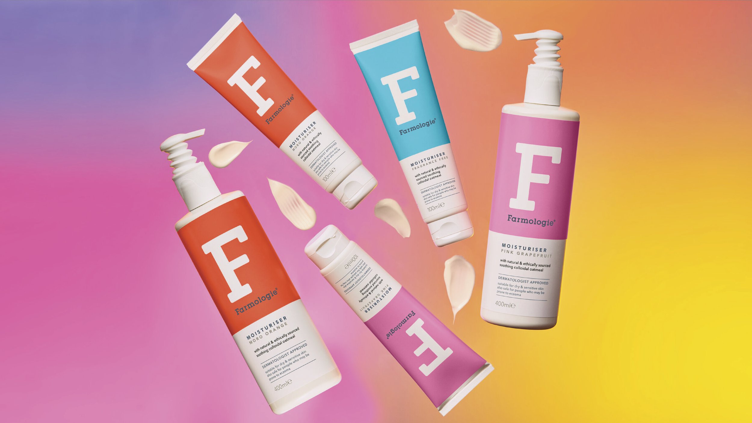
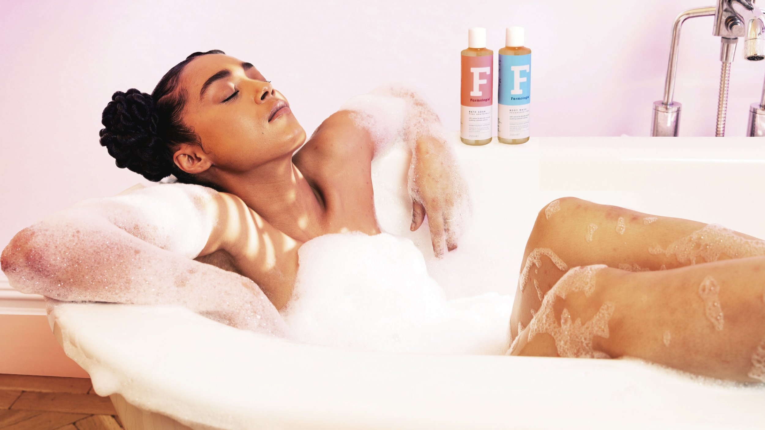
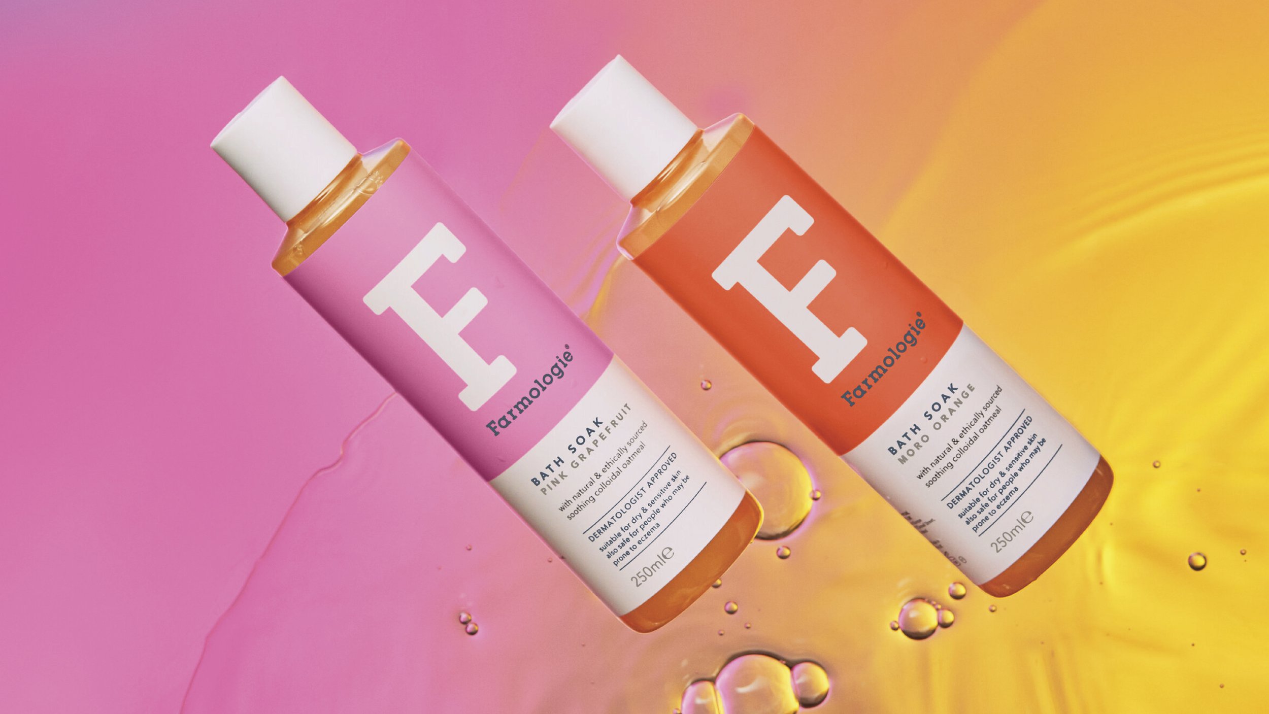
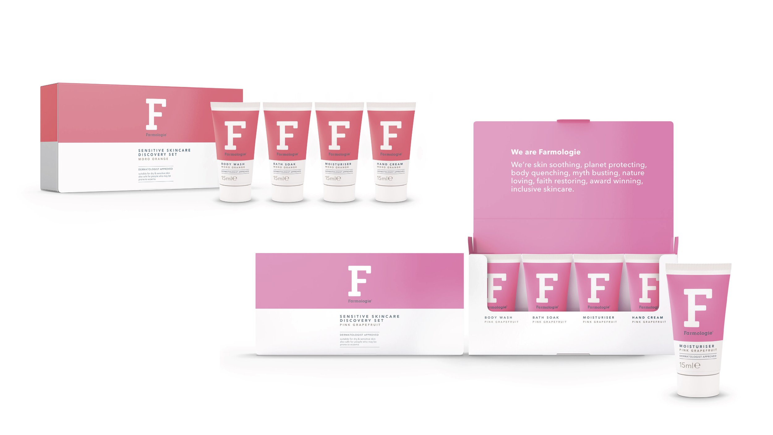
The insight, ‘sensitive skin doesn’t have to be boring’ and Child’s Farm philosophy, ‘be confident in your skin’ led us to create a simple, bold brand and pack design that stands out on the shelf with its vibrant neon colours, brought to life through creative brand imagery.
RESULTS
A successfully re-positioned brand identity with stand-out packaging design. Project completed to deadline and within budget, and snapped up by Superdrug.
DISCIPLINES: Brand Identity, Image Styling, Packaging, Packaging Guidelines.
“Laurence was chosen redesign the full Farmologie range due to his expert brand positioning and packaging knowledge in addition to his ability to work in an agile and dynamic way.”